Discovering Differentialy Expressed Genes (DEGs)
The first and most important ‘real’ analysis step we will do is finding genes that show a difference in expression between sample groups; the differentially expressed genes (DEGs). The concept might sound rather simple; calculate the ratios for all genes between samples to determine the fold-change (FC) denoting the factor of change in expression between groups. Then, filter out only those genes that actually show a difference. While this does give a list of genes showing different behaviour across samples, we need to focus on genes that do not only show a difference, but where that observed difference is also statistically significant!
To determine whether or not a gene can be classified as a significant DEG we are going to use existing libraries, one of which your own article might refer to. Before we do that we’re going to a brief manual examination of the count data to make sure that you properly understand what we’re looking for: significance and the Fold-Change value.
4.1 Pre-processing
Given the results of the exploratory data analysis performed in chapter 3, you might have concluded that there are one or more samples that show (very) deviating expression patterns compared to samples from the same group. As mentioned before, if you have more then enough (> 3) samples in a group, you might opt to remove a sample to reduce the noise as the statistical tests are very sensitive to this. Since we are performing all analysis steps programatically it is also very easy to test for DEGs with and without the sample(s) in question and see if the removal results in lower p-values (= higher significance). Remember to always properly document your choice and reasoning!
To perform a few more manual steps on our data before using other libraries, we will re-do the normalization with a different technique. A simple method of normalizing count data is to calculate the fragments per million mapped fragments (FPM, equal to CPM) value and then transform this with log2. Opposed to FPKM and RPKM this does not include the gene-length in its calculation (which you most likely don’t have). If your dataset also includes FPKM or RPKM (pre-normalized), you are allowed to use this data too.
FPM and CPM are simply dividing the count values for a sample by the total number of reads of that sample divided by 1 million as shown below:
# Perform a naive FPM normalization
# Note: log transformation includes a pseudocount of 1
counts.fpm <- log2( (counts / (colSums(counts) / 1e6)) + 1 )
Another step we can do - and this might be guided by your article - is to filter out (partially) inactive genes. While this is only required when using the edgeR library (DESeq2 includes its own low-count filtering methods), it is a good exercise to do manually and we will use it below when calculating the lFC values. Most data sets available contains a lot of 0-measurements (see for instance your density plot from the previous chapter); genes where no reads have mapped. In the R-studio Environment tab, click on your data set (or perform the View(data) command and click on one of the sample columns to order the data ascending. You will now most likely (unless you have bacterial data for instance) see a lot of zero values in all columns.
In an experiment with two groups, three replicates each, if three out of those six samples have 0-reads mapped, it is often advised to remove the gene completely. But this can be very subjective to the experiment, it might be expected (thus important) when comparing different tissues or knockout experiments. Also, genes with a (very) low read count (< 5) can give a very high (artificial) FC value (see the left hand side of an MA-plot). Comparing two samples where one has a value of 2 and the other 11, this reads as an up-regulated gene by a factor of 5.5 while it might actually just be noise!
-
Assignment: Search through your article for any advice on how to filter out zero values or low count genes. If there is nothing stated on this subject, think of your own tactic (or search the literature/ online!). It is perfectly fine to discuss with your peers.
- describe what you will be doing for this aspect; if you do not filter your data, clearly explain why not (most likely because the article stated a proper reason)
- Perform the filtering on your data set. For this you will most likely need to use one of the
apply,rowSums,rowMeansfunctions, combined with maybe thewhich,allandanyfunctions. - Manually verify that the rows removed were correctly filtered.
- Properly document how many genes have been filtered out!
4.2 The Fold Change Value
The FC is usually given as the calculated log2 of the case/control ratio. For example, gene A has an average expression of 30 mapped reads in the control group and 88 reads in the experiment group, the ratio case/control is 2.93. Ratio values > 1 indicate increased expression in the experiment in relation to the control and values between 0 and 1 indicate lower expression. The log2 transformed value of the ratio is calculated with log2(2.93) and results in 1.55. If the counts were reversed, the ratio would have been 30/88, which is 0.34. The previously calculated value of 2.93 means a 3-fold up regulation while the 0.34 value means 3-fold down regulation but as you can see the range of numbers is very different. Comparing log2 values this would be 1.55 and -1.55 which compares much better.
While it is very easy to calculate the FC for all genes at once, a simple FC value doesn’t mean much, yet! We still need to use the power that lie within the replicates we have for each sample group. Using these replicates, we want to determine if the observed FC is not just biological noise or a sequencing error.
-
Assignment: Create a
histogramof your log2-FC values for all genes. Apply the following steps on your FPM-normalized data for at least one comparison (no need to do it for all possible combinations):- average the replicates for two groups separately and add this as new columns to your FPM-normalized data set,
- calculate the log Fold Change (lFC); simply subtract one group (averaged-column) by another, usually
experiment-control- Note that since we already have log-transformed data, we do not calculate the ratio (
experiment/control). Also, because of the Logarithm quotient rule, we do not divide both average columns as with the ratio calculation, but we subtract: \(log_b{(x/y)} = log_b{(x)} - log_b{(y)}\)
- Note that since we already have log-transformed data, we do not calculate the ratio (
- plot the data using the
hist(logFC_column, breaks=60)function (change thebreaksargument if needed), - Add two vertical lines at
-1and1(usingabline(v=...)) to indicate some significance (2-fold change).- If your data shows very low fold-change values you might see no genes outside of this boundary. This does not mean that we will not find any significantly changed genes (DEGs).
If a calculated FC shows a large change in expression between groups this means nothing if the variation within a group is very high. For this reason we use some form of statistical test that checks both the variation in each group and the difference between groups of samples. In the simplest form this usually comes down to using a t-test:
“It can be used to determine if two sets of data are significantly different from each other”
Most often instead of manually performing t-tests or ANOVA analysis, the article mentions the use of one or more R libraries of other software packages for finding DEGs. This is exactly what we will also do in this chapter. The output of finding DEG’s always includes - but is not limited to - a list of p-values; one p-value per gene. This value indicates whether that gene is a statistically-significant differentially expressed gene (SDEG) and to find these genes of interest all we need to do is get all genes with a p-value below our threshold (i.e. 0.05).
4.3 Using Bioconductor Packages
This section demonstrates the use of two packages to perform DEG-analysis on count data. There are many packages available on Bioconductor for RNA-Seq analysis, such as DSS, EBSeq, NOISeq and BaySeq, but here we will focus on edgeR and DESeq2 for processing our count-based data. Chances are that one of these two packages are mentioned if the article described the use of R for the statistical analysis as they are the most widely accepted methods of processing gene expression data.
Both packages apply their own normalization methods (described in the sections below) therefore they only work on the raw count data. If your data consists of expected count data, you need to round these values down (using the floor function). You can choose one of these two packages to use, or use them both since it could increase statistical power and they are not very hard to use once you understand how to model the data as we’ll show next.
-
Assignment: Perform data-analysis using at least one of the two packages. If however your article mentioned a different R package for their analysis (for instance the
limmapackage) it is allowed to use this one instead. Other non-R packages can only be done as an extra (each dataset can always be analyzed using both edgeR and DESeq2). Optionally, use more than one package so we can compare the results between the these packages.- Start by documenting the relevant information from the article, also if they used other software for this analysis.
vignette function given the library name as argument. To see all available manuals (note; these are very different from the function-help documentation) execute the function without arguments: vignette().
4.3.1 The Design (matrix)
For all of these packages you need to properly specify how your samples are grouped. We have seen examples of this using an R factor object with the heatmap and MDS visualizations to tell which groups of samples we have and to which group each sample belongs. Reading the documentation for the below packages shows that this is an important part of performing DE-analysis. For example, the following code is shown in the edgeR documentation on page 8 where two sample groups are defined (numbered 1 and 2), placed in a factor object and used as input in the model.matrix function.
group <- factor(c(1,1,2,2), labels = c("Control", "Case"))
(design <- model.matrix( ~ group))
## (Intercept) groupCase
## 1 1 0
## 2 1 0
## 3 1 1
## 4 1 1
## attr(,"assign")
## [1] 0 1
## attr(,"contrasts")
## attr(,"contrasts")$group
## [1] "contr.treatment"This can often be a very complex part and while it seems very theoretical, in practice it’s not that difficult. To really grasp this topic it is strongly adviced to watch these two videos on how to define your design:
- StatQuest on YouTube: Using Linear Models for t-tests and ANOVA, Clearly Explained
- StatQuest on YouTube: Design Matrices For Linear Models, Clearly Explained
These videos expects some basic understanding of topics already discussed in the statistics course, otherwise for each mentioned topic in those videos he has other videos available explaining them. See the video-index for a handy overview of all topics discussed on that channel.
As mentioned before we need to think about the question we want to ask; which difference do we want to know? With two sample groups as shown above the question is rather easy; ‘which genes show an effect between case/ control samples?’. With more than two sample groups however the question becomes more complex. If we have an experiment comparing influence of three kinds of drugs (thus three groups) combined with effect over time, do we then want to focus on the influence of the drugs or the time? Both are valid questions but they define the way of how to create the design matrix.
Documentation on this subject is plenty, however it often contains overwhelming information. This page contains some valuable details (you can safely start reading at Choice of design), including the following text which is based on the same example used in the edgeR documentation:
“For the examples we cover here, we use linear models to make comparisons between different groups. Hence, the design matrices that we ultimately work with will have at least two columns: an intercept column, which consists of a column of 1’s, and a second column, which specifies which samples are in a second group. In this case, two coefficients are fit in the linear model: the intercept, which represents the population average of the first group, and a second coefficient, which represents the difference between the population averages of the second group and the first group. The latter is typically the coefficient we are interested in when we are performing statistical tests: we want to know if their is a difference between the two groups.”
If you have more then two sample groups and you want to change the question (i.e. test the influence of a different group), read the section about Releveling the factor.
4.3.2 DESeq2
We have used the DESeq2 library before and for DEG analysis we could re-use the DESeqDataSet object but it is adviced to create a new object with the proper design formula instead of the ~ 1 we used before.
There is no need to normalize the data using the previously used vst function because the DESeq2 library will normalize the count data for you as follows:
“DESeq computes a scaling factor for a given sample by computing the median of the ratio, for each gene, of its read count over its geometric mean across all samples. It then uses the assumption that most genes are not DE and uses this median of ratios to obtain the scaling factor associated with this sample.”
For our example data with four sample groups we re-use the annotation data frame as created in the EDA: Heatmap section (printed below). This allows us to do comparisons based on the celltype and ploidy of the samples. One minor note of importance is that the first level in each factor is taken as the reference, or for expression analysis, the control group. In our example (see the table below) the IPSC is the control-celltype and disomic the control-ploidy. In a simple case/ control study, the first level (check with the levels() function) should be the control group. Use the relevel() function if the levels need to be switched.
| Cell | Ploidy | |
|---|---|---|
| di_IPSC_r1 | IPSC | disomic |
| di_IPSC_r2 | IPSC | disomic |
| di_IPSC_r3 | IPSC | disomic |
| tri_IPSC_r1 | IPSC | trisomic |
| tri_IPSC_r2 | IPSC | trisomic |
| tri_IPSC_r3 | IPSC | trisomic |
| di_NEUR_r1 | Neuron | disomic |
| di_NEUR_r2 | Neuron | disomic |
| di_NEUR_r3 | Neuron | disomic |
| tri_NEUR_r1 | Neuron | trisomic |
| tri_NEUR_r2 | Neuron | trisomic |
| tri_NEUR_r3 | Neuron | trisomic |
Once you have a proper DESeqDataSet all you need to do is run the DESeq function on this object. Then, using the results function you can extract the DEGs as a DESeqResults object. Applying the summary function on these object(s) shows the number of up and down regulated DEGs as can be seen below that lists the impact of trisomy for the IPSC cell type (~800 DEGs) and comparing both the IPSC and Neuron disomic (control) cell types (as can be seen, a huge amount of genes are affected by differentiation from stem cell into cortical neurons):
| IPSC - Trisomic vs Disomic | Neuron - Trisomic vs Disomic |
|---|---|
out of 44504 with nonzero total read count adjusted p-value < 0.05 LFC > 0 (up) : 432, 0.97% LFC < 0 (down) : 417, 0.94% outliers [1] : 219, 0.49% low counts [2] : 17004, 38% (mean count < 6) [1] see 'cooksCutoff' argument of ?results [2] see 'independentFiltering' argument of ?results |
out of 44504 with nonzero total read count adjusted p-value < 0.05 LFC > 0 (up) : 8224, 18% LFC < 0 (down) : 9594, 22% outliers [1] : 219, 0.49% low counts [2] : 11906, 27% (mean count < 2) [1] see 'cooksCutoff' argument of ?results [2] see 'independentFiltering' argument of ?results |
The output of the results function contains the following columns for each gene:
| Column | Type | Description |
|---|---|---|
| baseMean | intermediate | mean of normalized counts for all samples |
| log2FoldChange | results | log2 fold change (MLE): group IPSC.trisomic vs IPSC.disomic |
| lfcSE | results | standard error: group IPSC.trisomic vs IPSC.disomic |
| stat | results | Wald statistic: group IPSC.trisomic vs IPSC.disomic |
| pvalue | results | Wald test p-value: group IPSC.trisomic vs IPSC.disomic |
| padj | results | BH adjusted p-values |
How you call the results function depends heavily on your experiment. As you can see from the output of the summary function, there are no details given about which comparison is shown (and also, by default a p-value of 0.1 is used instead of 0.05).
Depending on the design used to create the DESeqDataSet with, one or more comparisons can be made (applying the DESeq function calculates all and you filter with the results function). Read the help for the results function carefully; especially regarding the contrast argument where you define the comparison to retrieve. The following code can be used for our example experiment to get the DEGs comparing the celltypes using an adjusted p-value of 0.05:
The DESeq2 library contains a number of plotting functions that can be applied to a DESeqResults object (output of the results function), the most notable is the plotMA function. Note that the first MA-plot shown below has a very high range for the log fold changes (-10, 10) where the maximum value is 22.4 (shown as a triangle stating it is outside of the plotting range). A log fold change of 22 means >5 million increased expression which seems artificially high. DESeq2 includes a function to perform downstream processing of the estimated log fold change values called lfcShrink which is advised to always run afterwards. The reason for executing this function is described in the vignette with:
“It is more useful visualize the MA-plot for the shrunken log2 fold changes, which remove the noise associated with log2 fold changes from low count genes without requiring arbitrary filtering thresholds.”
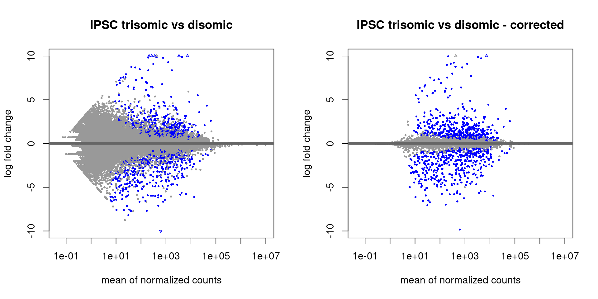
Figure 4.1: MA-plots with the standard DESeq2 output (left) and after shrinking with ‘lfcShrink’ (right)
Links
- Analyzing RNA-seq data with DESeq2 A very comprehensive guide to analyzing RNA-Seq data using DESeq2 (part of this document has been used in this material too!). It is adviced to read the first few sections of this guide and take a good look at the index of the document because there are many interesting sections that might be of help later.
- Publication, an accompanying article showing differences in performance compared to other methods and packages.
4.3.3 edgeR
One of the most mature libraries for RNA-Seq data analysis is the edgeR library available on Bioconductor. There is a very complete (sometimes a bit complex) manual available of which you need to read Chapter 2 with a focus on 2.1 to 2.7, 2.9 and - if you have a more complex design - 2.10. Section 1.4 (Quickstart) shows a code example on the steps needed to do DEG analysis using count data using the two glm methods (quasi-likelihood F-tests and likelihood ratio tests). All the steps shown there are identical for the non-glm method up to calculating the fit object which can be replaced by performing the exactTest function as shown in section 2.9.2.
The edgeR library will normalize the count data for you as follows:
“The trimmed means of M values (TMM) from Robinson and Oshlack, which is implemented in edgeR, computes a scaling factor between two experiments by using the weighted average of the subset of genes after excluding genes that exhibit high average read counts and genes that have large differences in expression.”
Running edgeR requires the raw count data together with the grouping-factor packaged in a DGEList object (with the DGEList() function). Furthermore, a proper model.matrix object (see the section on design) is needed as input for the estimateDisp function. The exact steps to take (there are more variations than with DESeq2) must be searched in the documentation linked above.
Once the analysis is done you can retrieve the actual results with the topTags function:
## Error in `h()`:
## ! error in evaluating the argument 'x' in selecting a method for function 'as.data.frame': object 'qlf' not found
Error in h():
! error in evaluating the argument ‘x’ in selecting a method for function ‘as.data.frame’: object ‘qlf’ not found
Backtrace:
▆
1. ├─pander::pander(as.data.frame(topTags(qlf)), caption = “Most significant genes given by edgeR”)
2. ├─BiocGenerics::as.data.frame(topTags(qlf))
3. ├─edgeR::topTags(qlf)
4. └─base::.handleSimpleError(…)
5. └─base (local) h(simpleError(msg, call))
There were 13 warnings (use warnings() to see them)
The package also contains a few plotting methods that you can use at intermediate steps during the analysis. For instance, after calculating the normalization factors (calcNormFactors), you can perform multi-dimensional scaling with the plotMDS function which is similar to what we’ve done manually in chapter three:
plotMDS(y)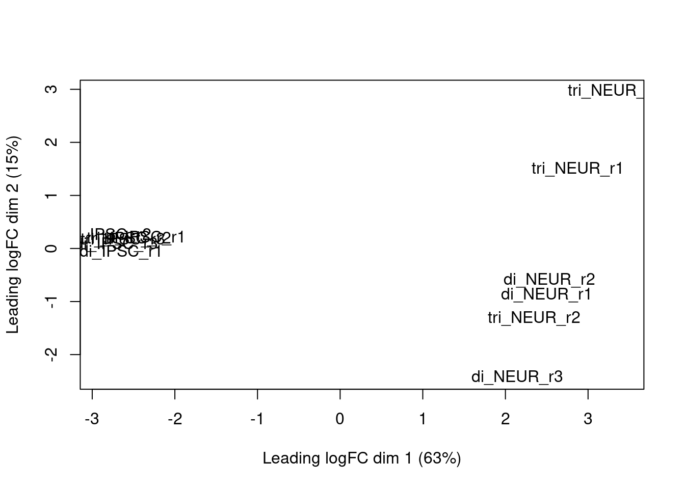
Figure 4.2: edgeR MDS plot based on the calculated log2 fold changes
Or the dispersion after running the estimateDisp function with the plotBCV function:
plotBCV(y)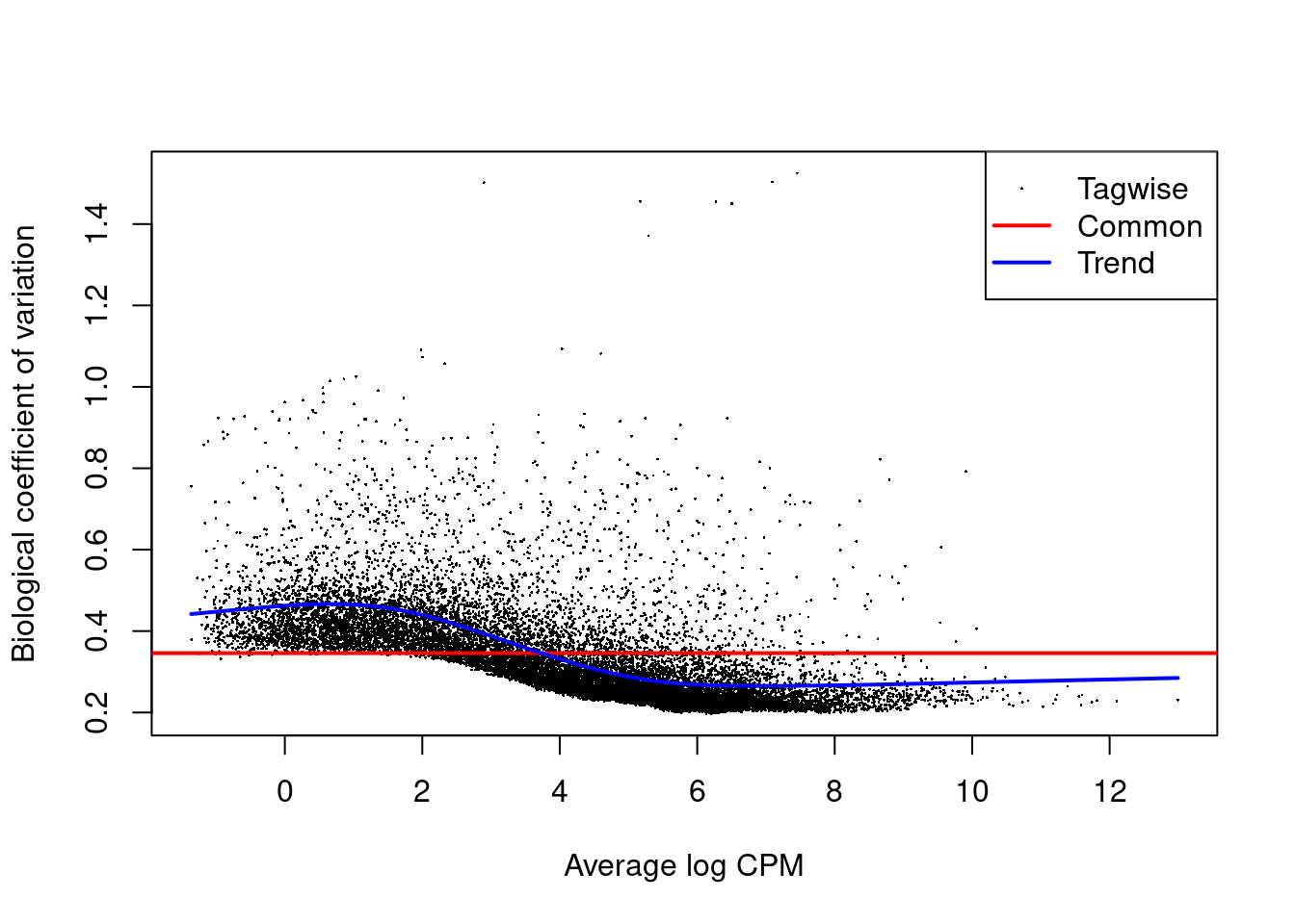
Figure 4.3: edgeR plot of several dispersion methods
Or the log-fold changes for all genes, once we have the output of the exactTest function (output et is an DGEExact object) with the plotSmear function. The abline shows a log-FC threshold:
deGenes <- decideTestsDGE(qlf, p=0.05)
deGenes <- rownames(qlf)[as.logical(deGenes)]
plotSmear(qlf, de.tags=deGenes)
abline(h=c(-1, 1), col=2)
Links
- Differential Expression Analysis using edgeR tutorial
- Another tutorial hosted on GitHub